1 Bảng kích thước các loại màn hình thiết bị phổ biến dùng tham khảo
| Loại thiết bị | Resolution | DP |
|---|---|---|
| Iphone 4 | 640 x 960 | 320 x 480 |
| Iphone 5 | 640 x 1136 | 320 x 528 |
| Iphone 6 | 750 x 1334 | 375 x 667 |
| Iphone 6s | 1080 x 1920 | 414 x 736 |
| Galaxy S6 | 1440 x 2560 | 360 x 640 |
| Note 4 | 1440 x 2560 | 400 x 853 |
| Nexus 6 | 1440 x 2560 | 411 x 731 |
| iPad Mini | 768 x 1024 | 768 x 1024 |
| iPad | 1536 x 2048 | 768 x 1024 |
| Typical Laptop | 1366 x 768 | 1366 x 768 |
| Typical Desktop | 1920 x 1080 | 1920 x 1080 |
2. Code css cho các loại màn hình như sau:
|
1 2 3 4 5 6 7 8 9 10 11 12 13 14 15 16 17 18 19 20 21 22 23 24 25 26 27 28 29 30 31 32 33 34 35 36 37 38 39 40 41 42 43 44 45 46 47 48 |
/* Smartphones (portrait and landscape) ----------- */ @media only screenand (min-device-width:320px)and (max-device-width:480px) { /* Styles */ } /* Smartphones (landscape) ----------- */ @media only screenand (min-width:321px) { /* Styles */ } /* Smartphones (portrait) ----------- */ @media only screenand (max-width:320px) { /* Styles */ } /* iPads (portrait and landscape) ----------- */ @media only screenand (min-device-width:768px)and (max-device-width:1024px) { /* Styles */ } /* iPads (landscape) ----------- */ @media only screenand (min-device-width:768px)and (max-device-width:1024px)and (orientation:landscape) { /* Styles */ } /* iPads (portrait) ----------- */ @media only screenand (min-device-width:768px)and (max-device-width:1024px)and (orientation:portrait) { /* Styles */ } /* Desktops and laptops ----------- */ @media only screenand (min-width:1224px) { /* Styles */ } /* Large screens ----------- */ @media only screenand (min-width:1824px) { /* Styles */ } /* iPhone 4 - 5s ----------- */ @mediaonly screen and (-webkit-min-device-pixel-ratio:1.5),only screen and (min-device-pixel-ratio:1.5) { /* Styles */ } /* iPhone 6 ----------- */ @mediaonly screen and (max-device-width:667px)only screen and (-webkit-device-pixel-ratio:2) { /* Styles */ } /* iPhone 6+----------- */ @mediaonly screen and (min-device-width:414px)only screen and (-webkit-device-pixel-ratio:3) { /*** You've spent way too much on a phone ***/ } /* Samsung Galaxy S7 Edge ----------- */ @media only screenand (-webkit-min-device-pixel-ratio:3)and (min-resolution:192dpi)and max-width:640px) { background-image:url('https: //i.ytimg.com/vi/zhBxfNm3rJE/maxresdefault.jpg'); } |
3. Minh họa các loại màn hình theo kích thước
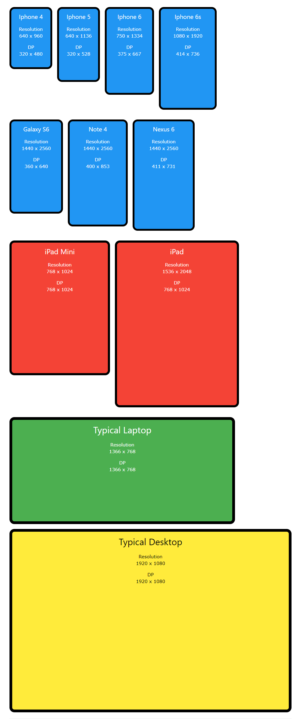
Kích thước các loại màn hình thiết bị moblie, tablet, laptop